Book covers are famously tough. Before my book The Bond King was published, I’d read award-winning book designer Na Kim’s account of designing for Jeffrey Eugenides’ book, describing it as a multi-draft exercise in ego death.
Which makes sense: the stakes are high, the goal precise but ambient. The cover must distill the book’s drama visually, create an interplay between abstract concepts and literal images; it must correctly balance the protagonist with the system they’re part of. It’s a miracle any cover is ever good.
The authors are not in control. It’s a collaborative process, but not really, because the author is not the expert. As with professional hair and makeup, the recipient is, uncomfortably, witness to an artistic process that is about them, centered on them, yet almost entirely devoid of their participation.
But I seem to have overextrapolated from Na Kim and understood that all first book cover designs are drafts. So when my agent suggested playing with different concepts, and asked if I had some ideas or covers I liked as inspiration, my ambient productivity anxiety took over—did I ever!
This very slight, low-stakes request for “inspiration” became an all-consuming assignment. My brain started spitting out cover ideas. And then more cover ideas. I was sure I would break through and create the Great American Finance-book-that-reads-like-a-Novel Cover. OK but what if you fold up bond certificates like a fan, and make those into the cliffs of Laguna, and then have the words BOND KING looming over, a little menacing and also precarious-looking? Or how about: my protagonist was famous in finance for being super into yoga before that was a thing, and there’s a minor plot point involving the “feathered peacock” handstand—what if we have a guy in a suit, alone on a beach, in the feathered peacock? OK but what if—
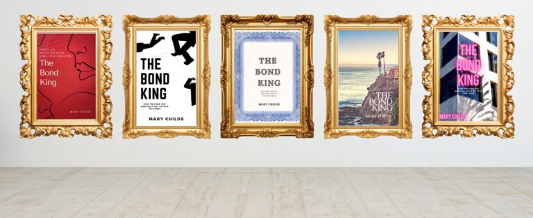
Everyone thinks designing a book cover is fun… and it is. I absolutely loved it. For me it paired perfectly with the pandemic lockdown and my new-mother insomnia. Holed up in my house, my infant and partner and dog sound asleep in the wee hours of the night, I stress-designed a total of 13 covers, of varying clarity of concept and quality of execution. Rather than consign them to the great book cover scrap heap of history, I’m choosing to share them here. But rest assured we went with the cover that the in-house art team came up with, which was clever, simple, and communicated what the book was about, which is really what you want.
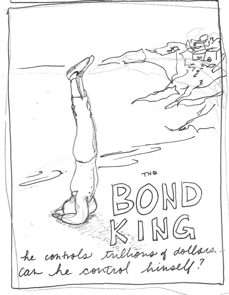
The Yoga Concepts
![]()
These first three are of a kind: trying to wedge our guy doing a yoga pose into the cover. Could he be the “I” in KING? Could he be on the beach, his formal little pressed suit pants falling and bunching thanks to gravity, because forces of nature come for us all? Something in there. You’ll see me play with this concept a lot.
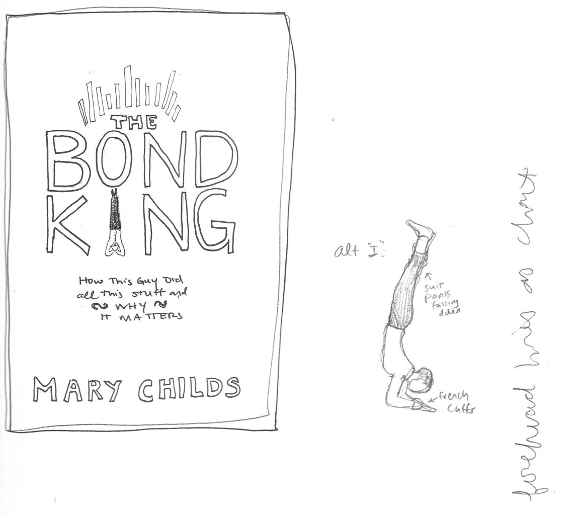
You can also see me beginning to workshop the subhed: it’s always a ragtag group of guys, isn’t it? I think the last of these three subheds is my favorite. I don’t know why we didn’t go with that.
The Bond Villain
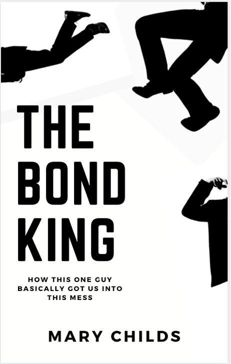
An on-the-nose reference to Robert Longo’s Men in the Cities, whose work is beloved by finance guys and also me, and in a derivative sense subtly implies cocaine and murder, which is always a positive.
This concept leans into the confusion I anticipated re: 007. Often when I said I was writing a book titled The Bond King, my conversation buddy would ask if I was talking about whoever invented James Bond. I don’t know the Broccolis, they are not my business, but here I seem to be embracing the confusion. I never watched Mad Men but in retrospect this does look too much like that show’s intro imaging, especially for a book that is dangerously attractive to would-be airport-reading-material-buyers interested in James Bond.
The Very Literal One
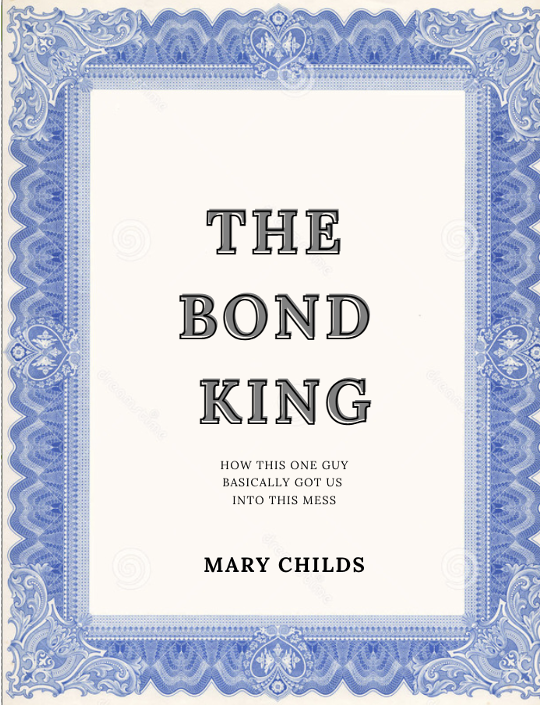
An ornate, elegant cover that would resemble an old-school bond certificate like the ones my protagonist Bill Gross might have encountered at the beginning of his career. It would have a thick border around a busy, text-filled field. There would be one big main part, with all the big text and most important information, and then tons of tinier boxes in orderly rows. Those would look like literal “coupons;” Gross used to cut those off with scissors and mail them in to the bond issuers to get the interest payments as promised. It would have been so rad if the bottom of the cover was perforated so readers could tear the coupons off as they read. With enough advance notice, I would have been happy to hand-perfoate each one (instead, I settled for ripping all the English ivy from my yard. Pre-publication is a weird time).
Alas, this was my best approximation, and it reads more Wedgwood platter than financial document.
The Overly Aggressive Concept That Makes Promises It Can’t Keep
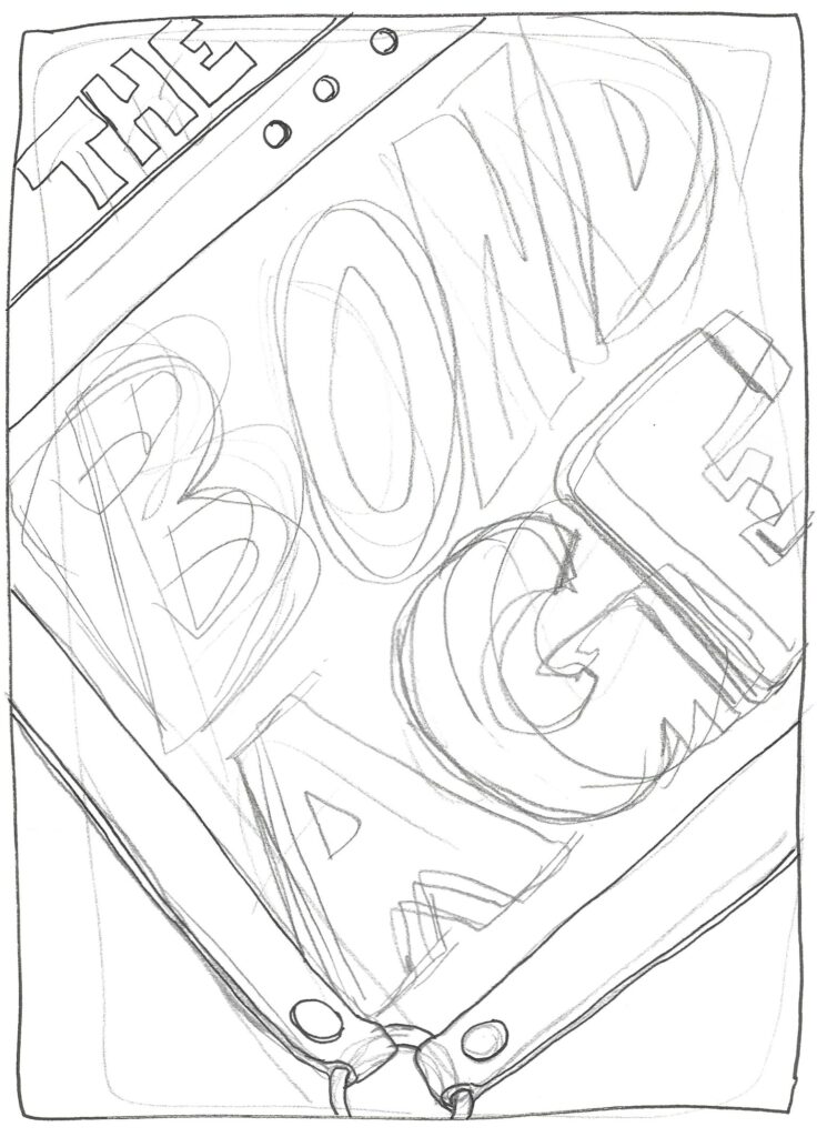
This was when I (unilaterally) decided to call my book The Bond Age. Get it? This cover concept has black leather straps appearing to bind the words in place and book itself shut. Come on! That’s good!
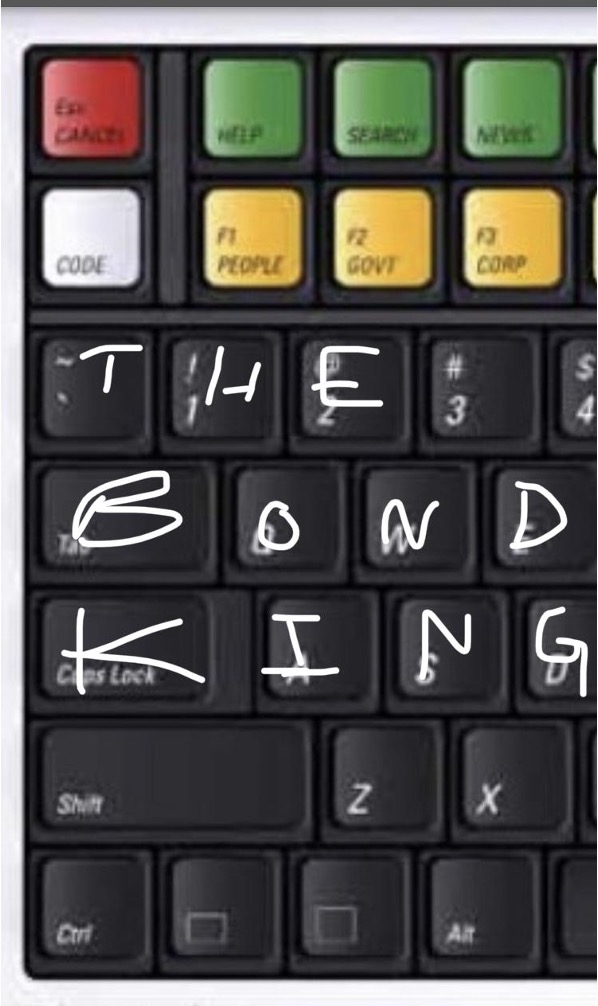
The Bloomberg Concepts
![]()
If you watch Industry on HBO, you know that all of finance and investing runs on Bloomberg Terminals. Just the look of those rainbow keyboards triggers an animal response in anyone who’s ever interacted with them. The flamboyant jewel tone of the top rows of keys, their soft click under finger, the way the body can type <GO>1<GO> to send a “MSG” before the thought to send it has even registered…it’s a special machine.
So here we have a rendering of the protagonist Bill Gross’s desk, at Janus, the much-smaller firm where he ended his career. Much of this scene would be pulled from real life, as it was captured in a display at the Smithsonian, along with the fuzzy dice he kept for luck. His many large screens indicate his import (everybody knows the more computer monitors you have the more important you are), and the view of California’s coastline indicates that he is making an irrational choice by being at this desk, so he must be making a boatload of money on all those screens. Looming in the distance is the structure of the company he founded and from which he was quit-fired. To the side we see the physical binder of his fund’s holdings that was printed and placed on his desk every morning, and his bowl of cereal because we know success is all about multitasking. (For reasons both jounalistic and legal, I should add: the subheds are not literal.)
The Chick Lit / Get Women To Read It Concept
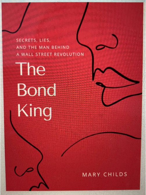
I wanted this book to reach a “non-traditional” audience, people who don’t always pick up finance books. I wanted to find those middle-aged dads in Gen-Z BookToker bodies. So I made a sort of romance novel cover. They are whispering secrets, and lies, about the man behind a Wall Street revolution. My toddler likes this one! (This image was taken before I remembered the “screenshot” tool.)
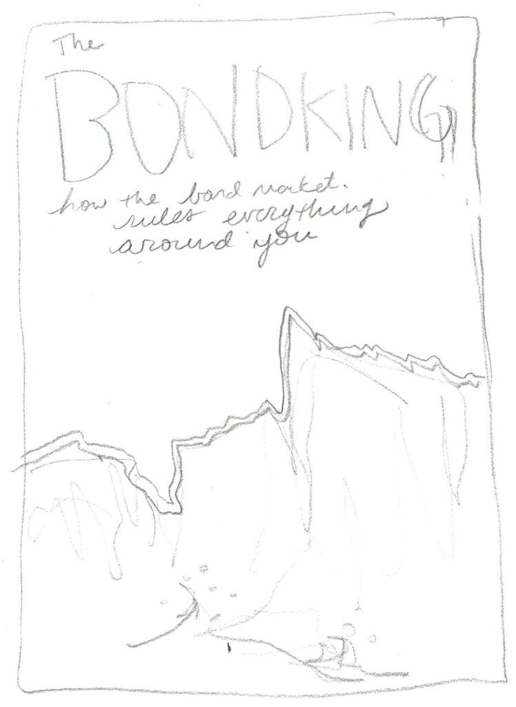
The Laguna Cliffs Concept

Still kind of on the broader-demographic-outreach kick here. The scene where this drama takes place is beautiful! Beautiful but hostile. We should use that, no? I think cliffs made out of bond certificates makes a lot of sense. They are both ornate and arresting! I like the implied reference to econophysics. I like the violence of the waves against the bold serenity of wealth, of human creation irrationally confident in its own durability.
No? Okay, but what if we are kind of looking up at the cliffs, towards the homes of these guys, but the jagged horizon line of the cliff’s edge is actually a chart of some asset’s price? Sorry, but I’m still into this one!
The Pynchon Concept
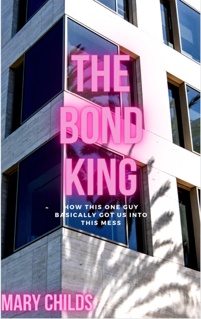
The splash of the neon, hinting at Vegas! Our protagonist first cut his teeth betting in Vegas, and of course we love the parallel between straight-up gambling and Wall Street, right? I also liked that pointy collision of dark and light, our eternal struggle! The nakedness and sharpness of the building—stone clearly unhappy it was forced into an unnatural smooth.
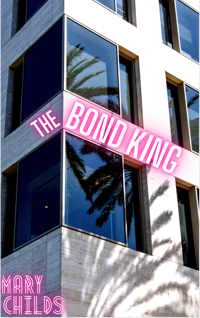
A real designer would have been able to center the corner of the building and the words might melt onto the sides of the corner, but I don’t have those skills.
The Longo-on-the-Go
![]()
I liked this one the most at the time. I like the force, the exertion of the pulling, the ambition of the climber, the one hanging on for dear life at the bottom. All accurate to what I’ve witnessed in my years covering finance! The line is all there is! But it turns out this is basically the tile for Business Wars, a then-new podcast very much in my wheelhouse, from Wondery. I hadn’t heard of it at the time, but I’m really glad I didn’t accidentally gank their logo.
Please Just Envision This One In Your Mind Yourself, I Apologize
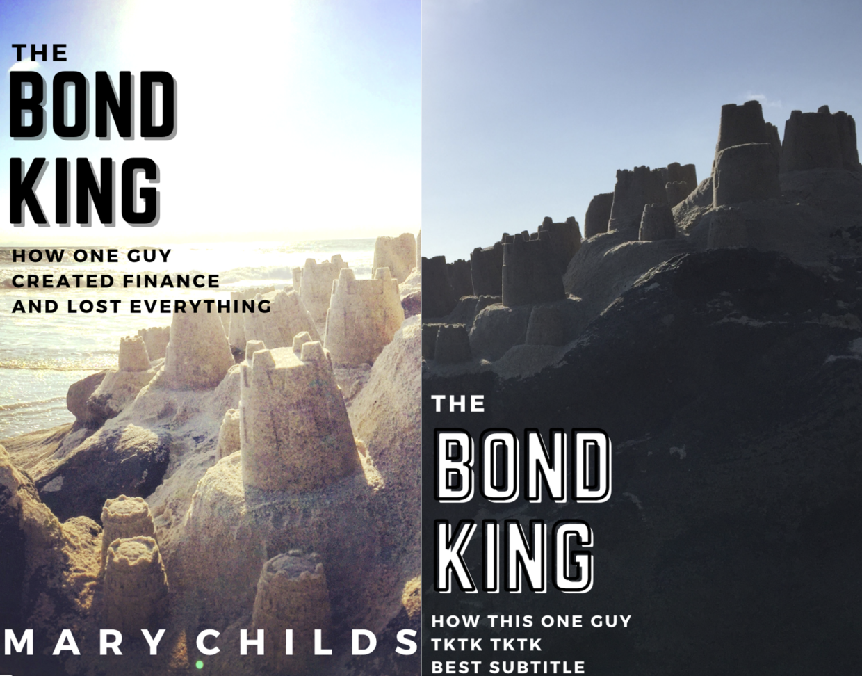
The execution here is probably the worst, and, as you can see, my subtitles are degrading; we are nearing the end of our journey. These are words on top of pictures I think I took myself in Newport Beach, where my book is set, but I was trying to evoke the Pimco building (where all the drama went down)… or Wall-Street-looking skyscrapers… but they’re made out of sand… except not cheesy-looking. The messaging is again something about the massive scale and importance of the subjects of my book and what they built, and fragility/ephemerality of it all… but perhaps it is unfair to imply, even visually, that a real company is made of sand. It’s not! It’s a real company and it continues to this day. Maybe sand implies fraud, and that’s not what we are talking about in my book. But, also, these mockups were fundamentally misleading in that they kind of looked like romance novels; no one even smooches in my book. I’m glad we left this concept behind.
The Winner
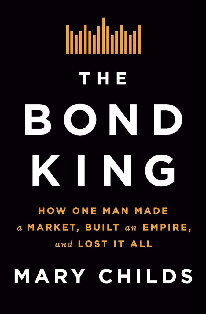
This one actually is the best, don’t you think? It’s got a bar chart that visually references the Bloomberg color scheme, so it feels like what you’d see if you pulled up a company’s annual profits or revenue, but it’s not so insider-y that those without a finance background would be repelled. Brilliantly, the bars make a crown that sits atop the title. It presents very masculine, which is appropriate. Also my name is very big, which I appreciate. Let’s hear it for art teams—experts for a reason.
__________________________________
The Bond King by Mary Childs is available now via Flatiron Books.